
About the component
An image container is used to show an image, a title, rich-text, and optionally link to further content. This component allows the image to be placed on the left handside and the other components on the right hand side. Image container is built on top of Teaser and hence when you configure image container you will see the Teaser dialog being displayed.
Points to remember about this component
- There is no top & bottom style in the new Image Container
- Image size can be slightly increased by setting the style of Image Grid Count to 'seven'. The default is 50-50 for image and text which means the grid count is 6.
View the component style options
Click here for figma link
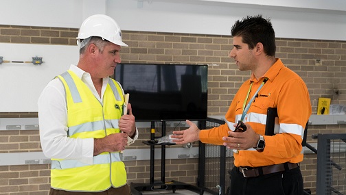
Image container - image on left (padding 30px)
Added TEsting tel number - For support, call us at 1800 687 626.

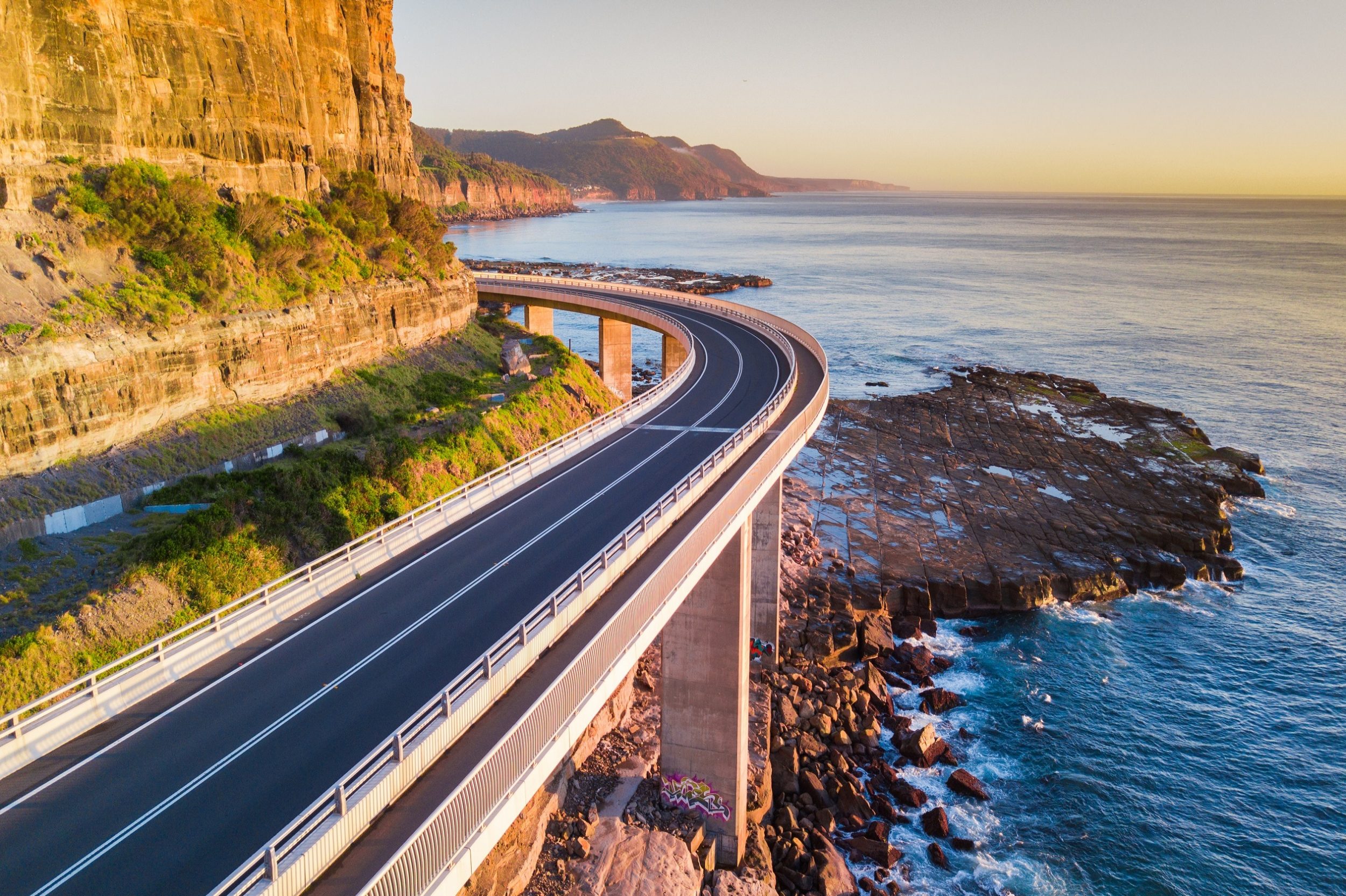
Image container - image on right (padding 30px)

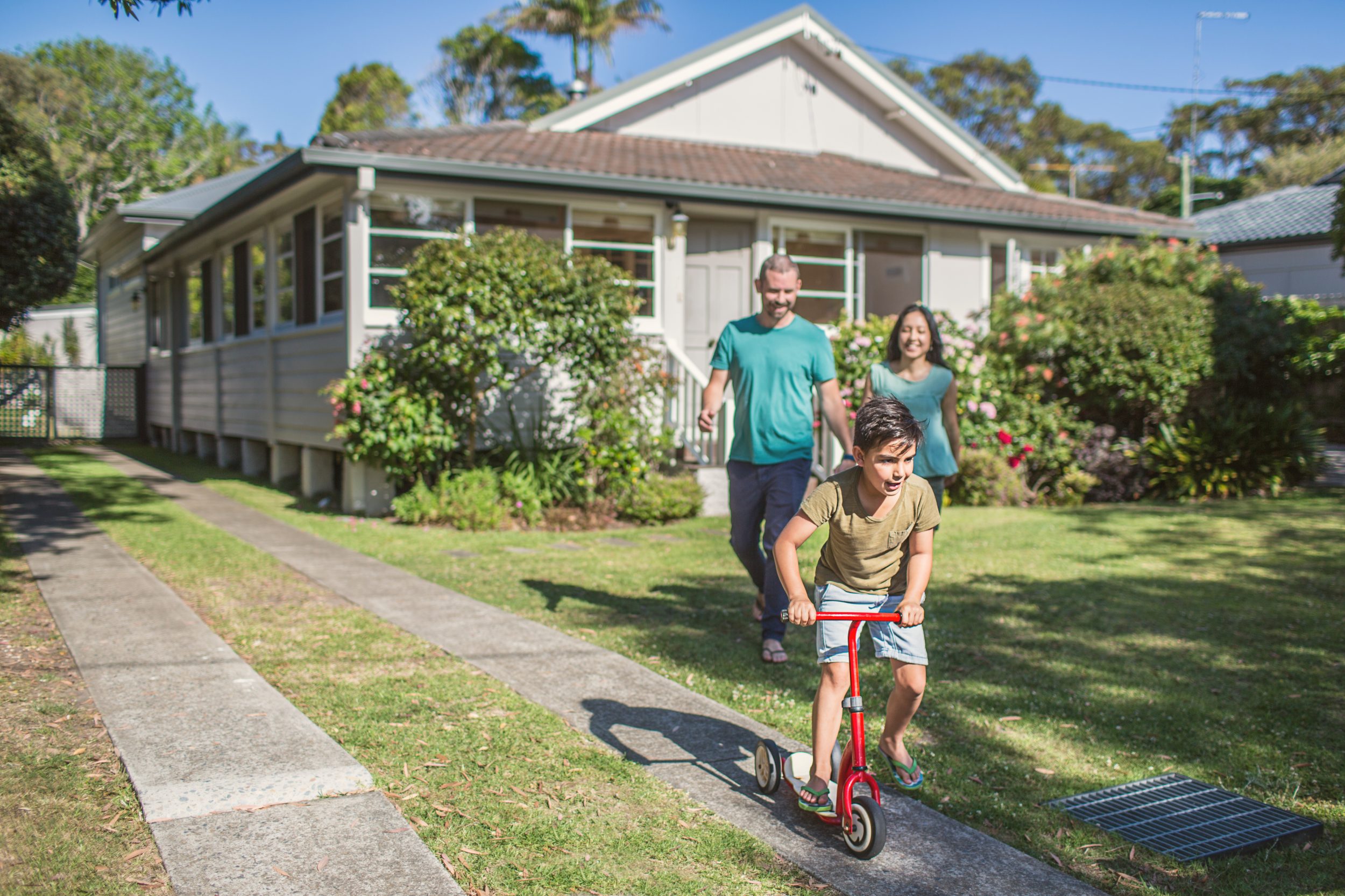
Image container - image on left (padding 50px)
Added TEsting tel number - For support, call us at 1800 687 626.

Image container - image on left (padding 50px)
Added TEsting tel number - For support, call us at 1800 687 626.
Image container - image on right (padding 50px)

Image container - image on right (padding 50px)

Added TEsting tel number - For support, call us at 1800 687 626.
Shadow styles


Basic image component
